Visualizing distributions: histograms and cumulative distributions
Create a dual distribution visualization of the desired column in a DataFrame. A histogram shows the distribution of observations, and bottom chart displays them all showing their cumulative distribution. Optionally, you can set hover_name to show the actual value of each observation on hover.
The ecdf function is a thin wrapper for the plotly.express function of the same name. It adds a few minor options to it.
It can be used to visualize how numeric variables are distributed, both using a histogram, as well the cumulative distribution (ecdf: empirical cumulative distribution function).
While the histogram shows us how many observations we have for each interval, the ecdf shows each observation and its particular position in the ranking order.
Note that you have access to all the parameters of the ecdf function, so please check them if you want to see what else can be modified with:
Hovering over any of the points gives you a set of data about that point, and tells you more about it relative to the dataset:
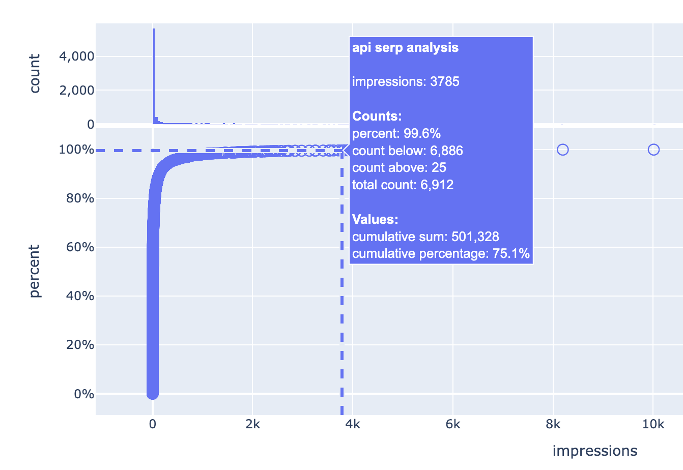
label
meaning
top label
this is the actual value, in this case it is the keyword “api serp analysis”
first value (impressions)
this is the metric and value of this item, in this case we are measuring impressions, and the impressions for “api serp analysis” is 3,785
Counts
this section has four values that tell you about the counts of the items
percent
the percentage of items below the current value, 99.6% of the items are less than or equal to the current one in this case
count below
how many items are less than the current one
count above
how many items are greater than the current one
total count
the number of all items in the dataset, this is unchanged throughout the dataset
Values
this section shows two values telling about the dataset’s sum of values up to this data point
cumulative sum
the total metric (impressions in this case) up to this point
cumulative percentage
the percentage of metric (impressions) up to this point
In other words, the keyword “api serp analysis” generated more impressions than 99.6% of the items in the list. There are 6,886 keywords with less impressions, and 25 keywords with more impressions (out of a total of 6,912 keywords).
Keywords up to this point have generated a total of 501,328 impressions, which is 75.1% of the sum of all impressions of all keywords.
In other cases the distribution can be much more extreme, as is the case in some examples below.
The aim is to show how (in)significant a set of values are in the dataset.
Mousing over any of the circles you see the query it represents, the value represented (impressions in this case), how many other observations are equal-to or below it as a percentage, and also the counts of observations above and below.
Let’s do the same with URLs in an XML sitemap. We can visualize the cumulative distribution of the loc tags, and give it more context by showing each URL when we mouseover. This becomes a rich report with a lot of data on each URL.
We can immediately see in the above chart that the content on this website spans the period September 2023 - June 2024. We can clearly see that most updates happened in the first periods by looking at the top histogram.
When we have a vertically looking set of dots, we know that there were many updates happening in a very short period of time. These are likely being updated in a batch.
With a simple option we can split and color the chart by the website segment.
I took the top five values in /dir_1/ and labelled all other values as “Others”.
By using facet_row="segment" we have six charts showing us the trend for each segment of the website separately.
The same applies to keywords, as it is crucial to know how they are distributed. We can also gain more insight after categorizing the keywords and applying the same technique we applied in the previous example.
fig = ecdf( photography, x="volume", hover_name="keyword", height=750, title="Photography keywords", subtitle="Keyword research data - split by category", template="plotly_dark", facet_row="category", color="category",) for annotation in fig.layout.annotations: annotation.text =""fig
GSC queries - by device
nba = pd.read_csv("data/nba_keywords.csv")nba.head()
query
device
impressions
0
larry bird stats
Mobile
215
1
stephen curry stats
Desktop
209
2
michael jordan stats
Desktop
197
3
larry bird stats
Desktop
174
4
kobe bryant stats
Desktop
129
Groupby queries and visualize impressions
fig = ecdf( nba.groupby("query")["impressions"].sum().reset_index(), x="impressions", title="GSC impressions by query", height=550, template="plotly_dark", hover_name="query",)# optional, just to demonstrate styling optionsfig.data[0].marker.color ="silver"fig.data[1].marker.color ="silver"fig.layout.font.color ="silver"fig.update_xaxes(gridcolor="#222222")fig.update_yaxes(gridcolor="#222222")fig.layout.yaxis.zeroline =Falsefig.layout.yaxis2.zeroline =Falsefig
GSC queries - by device
fig = ecdf( nba, x="impressions", template="plotly_white", facet_row="device", color="device", hover_name="query", height=600, color_discrete_sequence=px.colors.qualitative.Vivid, title="GSC query impressions - by device",)# optional, just to demonstrate styling optionsfig.layout.paper_bgcolor ="#efefef"fig.layout.plot_bgcolor ="#efefef"fig.update_xaxes(gridcolor="gray")fig.update_yaxes(gridcolor="gray")fig